Downtown Design Philosophy
Milford was blessed with some physical constraints that have inadvertently helped to retain a compact, urban core. Downtown is bounded by the river, railroad, ponds and hills, all of which provided obstacles to urban renewal efforts in the 1960's and 1970's that removed historic structures and replaced them with suburban models of development, ruining many downtowns. Old timers will tell you that they were approached with some of those ideas, and soundly rejected them.
Good design requires you to look outward first. Painters, architects and urban designers first study the masters and find out what is the glue that holds a composition together? What are the components that make one town seem more comfortable, livelier, inviting, than another? What are the mistakes other communities have made, including us?
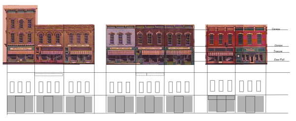
Then, we look inward. We remember us. The architectural moments that have built our memory of place. The Arch. The waterfall. Central Park. The Opera House. The old Deli at South Main. The string of 1880's buildings that all have the same rhythm of openings: triple second story windows, cornices aligned, storefronts with recessed openings with knee walls that line up to their neighbor's.
Good design requires looking forward without forgetting what got you there.
Some communities get stuck. Sometimes its in a mode of style, like the "Alpine" look that was popularized in the 70's. Sometimes its whole towns that dictate colors of brick, creating homogenous and soulless places. The best towns are a collection of styles and eras, of old and new, of finished and not-so-finished, a collection of memories and a promise of better ones.
The DDA has a core principle that guides all decisions: Milford is a unique and special place with its own character that should be maintained and celebrated. That character is informed by significant historic structures, a traditional grid pattern of narrow streets, a plethora of greenspace within and surrounding the community---all of which creates a very strong, intimate pedestrian environment. Walkability has become somewhat of a buzzword in recent years, but at its core, walkability is about scale, massing, variation of architecture, the pattern of streets, and outdoor amenities within reach. The Milford Downtown Development Authority employs Smart Growth strategies for private and public improvements in the Village. The DDA has been a member of the National Main Street Program for over 25 years, a program of the National Trust for Historic Preservation and steeped in a tradition of preservation of historic places.
Well managed downtown programs have two very defined, seemingly divergent goals:
- Maintain the architectural heritage of the community. This means celebrating and encouraging the preservation of significant historic structures.
- Manage growth in a way that complements that heritage, welcomes innovation and helps to create diversity of style that is inherent in all downtowns over time. Many downtowns have adopted "themes", so to speak, which have proved to be somewhat trendy and static and tend to age over time. Real downtowns reflect a variety of styles, eras and socio-economic status. That's what makes them interesting.
There are some general guiding principles that the DDA employs to accomplish these goals with new development projects:
1. Mixed land uses.
What makes historic downtowns unique is that they are a tight combination of all different types of uses----commercial, residential, recreational---sometimes in the same building, often in the same block. Historically, this was necessary as most people did not travel by car. (Automobile development is what created the suburbs. What that means today is that people can walk back and forth between these uses and it creates a more vibrant atmosphere.
2. Compatible Architecture.
Downtown buildings don't all have to look the same, nor is that advisable. But, the good ones do have some elements in common:
- Recessed door openings
- Mostly glass storefront on the 1st floor with a knee wall
- Dimensional fenestrations and finishes. Materials that are textural, with details that protrude and recess, which complements the sculptural quality of the buildings. This adds dimension to the street, allowing the sun to cast shadows along the sightline.
- Usually a cornice above
- Transom areas
- In Milford, recessed second floor windows are usually set in triples
3. Spatial Organization (the space between buildings)
Main Street creates a sense of enclosure and intimacy because of the ratio between the width of the street and the height of the buildings. The zero-lot line pattern of development creates an architectural wall that is interesting, textural and comforting. Pedestrian islands reduce the amount of road expanse between nodes. Smartly places pocket parks link people from one side of the street to the other (think Heritage Wheel). Wide sidewalks allow outdoor dining.
4. Maintaining and creating a sense of place
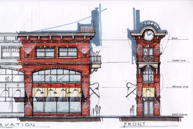
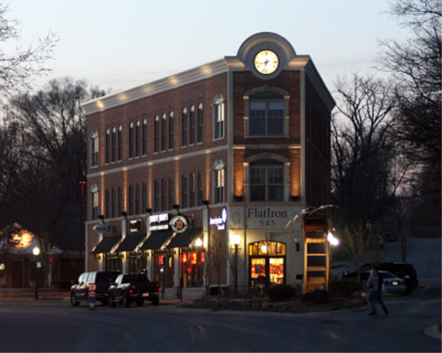
You can't make something from nothing. So, good design starts with what's there. Some communities have "created" Main Streets, and the result is stylistically interesting, but lacks authenticity and depth. A better approach, is to extend the pattern of development that already exists in the community. Inch Main Street north of Commerce, resulting in the Mill Valley plaza, the Flat Iron and the Heritage Wheel. Celebrate the great Albert Kahn Powerhouse, the inherent curve in the earth, the creek by inserting the Amphitheater there. Celebrate new architecture within the footprint of missing historic buildings. Create street trees, flower beds, walkways, resting places, pocket parks for people to enjoy.
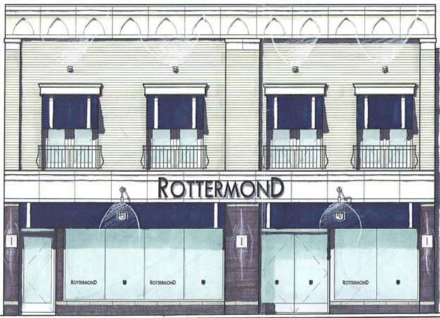
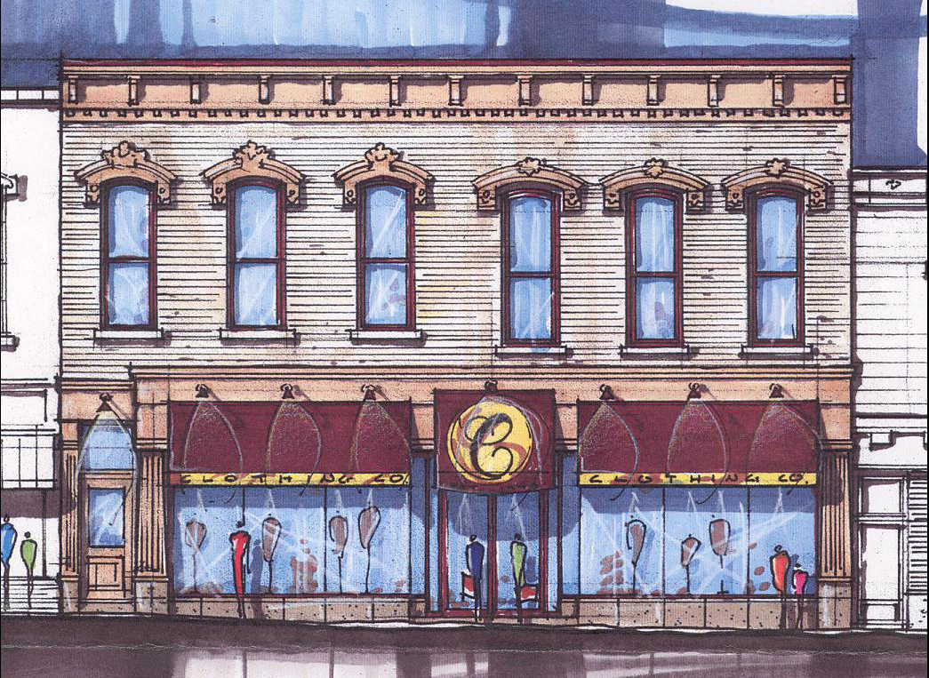
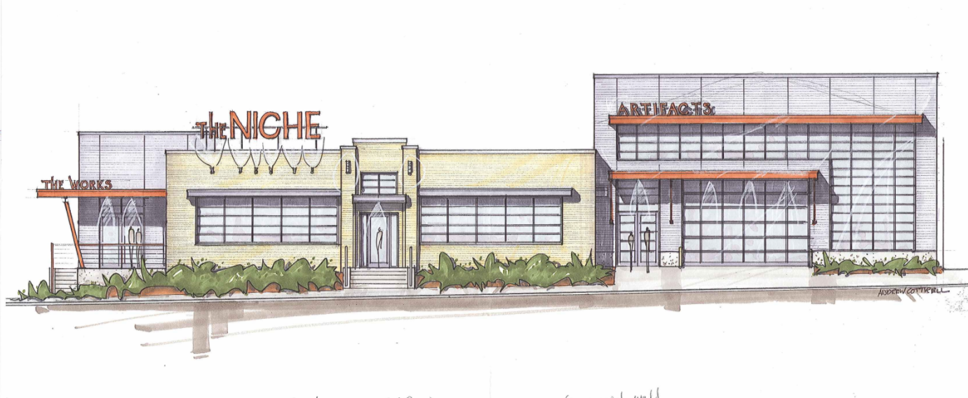
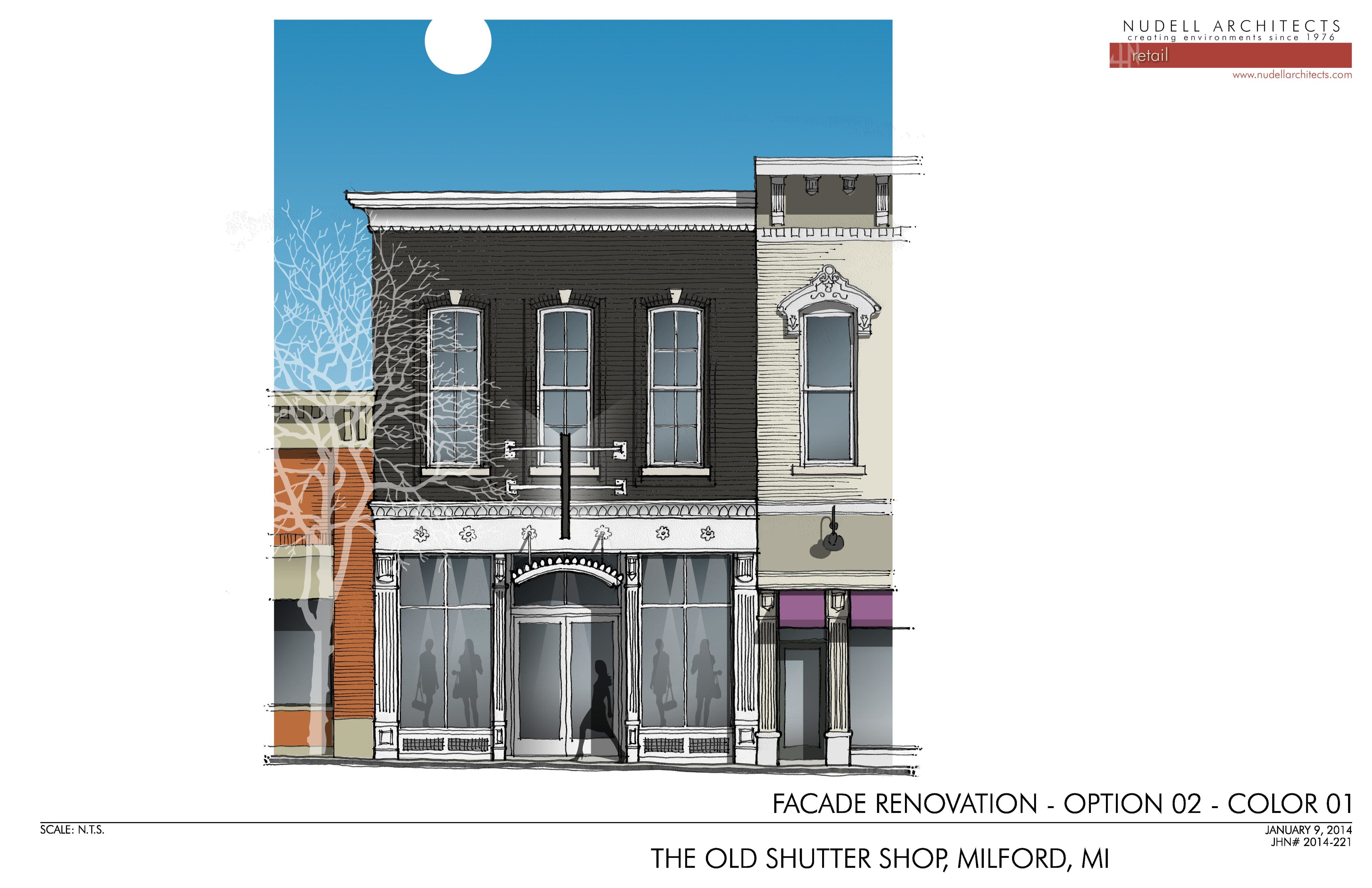
5. Buildings for which the DDA has created initial conceptual designs:
